
ℹ️ Skip to key parts of the session by clicking on the chapter dots along the timeline.
Welcome to Card of the Month! This time, Steve Rawling (Author of Storyteller Tactics) talks us through the Show & Tell tactic. This tactic helps you balance what you show people with what you tell them so that you keep their attention firmly on you, and avoid confusing your audience.
The video chapters above align with the chapters below, so you can combine reading the summary with watching some or all of it in detail.
Key takeaways:
- This tactic is great for planning your presentation images and script.
- Use an absolute maximum of ten words on any slide.
- Show an image, introduce it, then talk around it. Repeat.
- Don’t show an image and describe it for ages - that’s dull.
- Don’t show an image and talk about something else - that’s confusing.
- This approach is also really useful for planning video content.
- Connect on a deeper level by including more than visuals and audio. Talk about tastes, smells, feelings etc to truly connect.
The session is talking about ‘Show & Tell’ mostly within a screen - on a video call, for example. But there is another level: where you put something into someone’s hands. This starts to involve the other senses – touch, smell… even taste. We’ll come back to that!
We’ll start with visuals... they are what kills your presentation if you get them wrong.
Chapter 1: bad examples
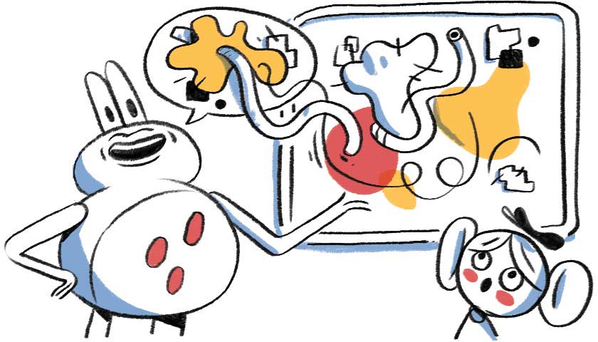
Steve explains how the US Army used the opposite of this approach to intentionally bore and confuse people (journalists). They called it ‘hypnotising chickens’ and the aim was to ensure the journalists were too bored to listen properly and ask difficult questions. He shares an example image that is an absolute mess of a mind map using lots of acronyms and teeny text linked up with impossible to follow lines.

Watch that session for a bit more detail on that and ‘death by powerpoint’. Steve then goes on to explain why using too much text is just as detrimental as using poor graphics.
Your audience can read your slides in their head at a rate of around 300 words per minute (yes, really!), while you can only speak them aloud at around 180 words per minute. So the audience races ahead and you become an annoying drone in the background. By the time you catch up, you’re just telling them things that they already know!
Or, if you don’t read the text and start talking about something else, you’ll confuse them.
So that’s your choice: do you want them to be bored or confused?
What do you do, then? You put a handful of keywords on the screen (Steve says five words - up to ten maximum). Something people can read in a couple of seconds before they return their attention to you. You can even do reveals of one fact at a time. And remember to come out of screen share to show your face in full whenever you can if you’re doing an online presentation. You are the star of the show. You control the attention.
And think of it like this. If you are putting all the words up on the screen… why not just email it to everyone instead?
Chapter 2: treat your presentation like a washing line
Bear with us here: your images are the clothes line, and what you’re telling people is the clothes. It’s a simple visual way to understand the connection between the two. A horizontal line (the clothes line) that reflects your story in images. The clothes are your words (and the why).

When you put an image on the screen, you have to immediately tell the audience what it’s there for. After that, don’t describe the image or you’ll bore people: they can see it! So diverge slightly - tell them the bits they can’t see. This is the hang of the clothes away from the clothes line.
But don’t stray too far! Or people will try to split their attention (unsuccessfully) between you and the image.
Instead, introduce a new image, and talk about that. There are key words and phrases you can use to renew focus on the screen. These are your pegs:
- As you can see…
- What you’re looking at here is…
- This is what that looks like…
- Look…
- This image shows…
This gives you a rhythm to follow when planning your presentation. How many points are you making? That’s how many images you’ll need. Steve also uses the images (with two or three words) as cues for his memory, instead of a script.
Images show who, what, where, when and even - in some cases - how. But they can’t show why. So your who, what, where, when and how are included in your images (washing line) and your why is your clothes.
Chapter 3: Q&A part 1
Xenia: I’m an academic. I follow your advice and keep things simple, but some people have said that if I don’t include the detail and references on screen, it looks like I don’t know those details. How do I balance this expectation with best practice?
Steve agrees that in academic circles there is an expectation that you show your working. And of course, ‘house style’ is often important, even if it’s not technically best practice. Steve recommends using a ‘bullet reveal’ approach for this; it results in too much text on the screen, but each line has been revealed individually, so you are still in control and people can’t read ahead so far.
Xenia added that the people who know the details are often the ones who want to see it on the screen. Steve asks: who is your main audience? If it’s the academics and you need to show that you’re at their level, that will be a different presentation to a group of students.
Even an academic paper uses a story structure: beginning, middle, end. Structure the presentation without giving them the end (the findings) first. Use the Data Detectives tactic to learn how to structure this!
Steve: is there any Pip Decks advice about not just constructing the story, but how to deliver it?
Public speaking skills are really hard to convey on cards, but there are some discussions around a possible expansion pack… in the meantime though, Steve has shared a tonne of his own knowledge about this in a series of blogs. For example:
- Essential tips for your first presentation
- How to be an engaging public speaker
- Guide to dealing with questions after your presentation
- How to start your presentation
Penny: is it better to have more slides with less text on them?
Steve says, emphatically: yes! It’s all about controlling the flow of information, so even if you need to include lots of text - just spread it over more slides!
Chapter 4: Miro activity
It’s rarely just ‘show and tell’ in Steve’s sessions. This part of the video covers an activity the group did using an interactive Miro board. Watch this if you’d like to see the ‘washing line’ analogy in action! This is the process you use to plan your presentation. It’s also really good for planning a video. Or, you can read the key tips from this chapter and skip ahead to the next one:
- You can do a presentation with zero text - or with only text! Or a mix
- As soon as you show the first image, tell people what they are looking at (who, what, where, when, how). That helps inform your script: what is the image, what’s the why?
- Showing video during a presentation can be problematic if the video is too long; in Steve’s example, it’s six minutes long. They’re trapped for six minutes - you can’t stop it, even if they look bored. Only use absolutely brilliant videos that bring something into the room that you can’t. A customer story, for example.
Chapter 5: beyond the visual
Steve: "A few years ago, I was having a meal with a group of middle-aged men. We were talking about tattoos: where’s the most painful place to have one? Turns out, it’s under the back of your arm - very sensitive skin. So hold up your arm and pinch your skin there! OW. That really hurts, doesn’t it?"
What happened is that everyone who pinched themselves shared a physical experience. It’s much deeper than any image Steve could have shown to illustrate that point. In Show & Tell it’s all about the visual… but can you go deeper? Can you talk about smells, taste, pain, touch, heat? Gut feelings? Going beyond sight helps you truly connect with people on a deeper level.
Unusually, we’ll give the last word before the Q&A to an attendee, Sam, who coined the phrase “Show and smell” to describe that last point. Thanks Sam!
Chapter 6: Q&A part 2
Is this the same approach used on things like the Jon Stewart show, where an image appears in a box as he’s talking?
Yes - that’s exactly it. In fact, Steve says, there’s a whole team of people who are working behind the scenes to ensure that image appears at exactly the right time, so watch it to see how to get your timing nailed on. That’s why presenters use a script - it allows all the backstage team to see what’s coming up (lighting, audio, camera etc). You’re controlling it yourself, so you don’t have to worry about a tight script. You can do it post-production if you’re using this method to create a video.
Should you write a script and stick to it?
You can - and some people find it reassuring to do so. Steve uses bullet points and ad libs around them. He didn’t like court reporting as a journalist as he had to be legally very accurate… and he quite liked going off on tangents!
Advice for videoless meetings on Zoom?
One of Steve’s friends from radio once said: “Radio is better: it has the best pictures”. When you start describing something, the listener creates a movie in their head and it’s better than any movie you can film. That’s why watching a film of a book you have read and enjoyed is often disappointing. Check out the Movie Time tactic for more on how to do this!
How do you bring interaction into the presentation?
Interaction is really crucial for holding attention. It’s a conversation, not a lecture. You can read more about Steve’s approach to getting people to ask questions at the end of the presentation.
Book recommendations for introverts: The Alter Ego Effect by Todd Herman and Quiet by Susan Kane.
There’s a nice little crossover between this tactic and Workshop Tactic’s Storyboard, by the way!
And that's a wrap! Thanks to everyone who joined us. If you'd like to join one of these events, check out our events calendar to see what's coming up.
Level up your career with Pip Club
Join 100,000+ leaders who get unique tips every week on storytelling, leadership and productivity - plus exclusive how-to guides, first-dibs on upcoming Pip Decks and our very best discounts.


One of the few newsletters I look forward to.
— Dave Cunningham, Head of DesignOps @ NHS